Painting your own furoshiki wrap
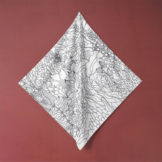
Our 'paint it yourself' scarves are 100% cotton, printed on white with dark grey outlines, ready & waiting for you to colour in and unleash your meditative creativity. The world's your oyster with whatever you want to make from them, but read on to hear a few ideas to get you started!
 }
}
First, let's talk about my favourite paints for working with fabric! Technically you can use any paints, but those specially designed for fabric are engineered to flex with your fabric so that they don't crack, and after heat setting most will not fade or run / wash out with use. If you prefer not to invest in fabric paint but already have a lot of other paints at home, you can buy fabric mediums which you add to your existing paint to get the same benefits. I don't have much experience working with these so I can't vouch for them, but it's worth experimenting with!
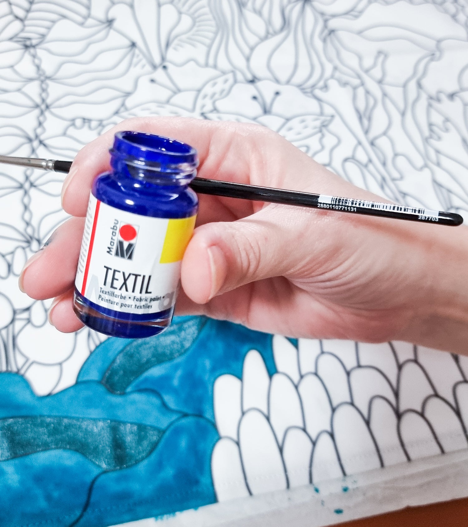
Marabu Textil are one of the first fabric paints I tried - and I really love working with the bold, bright colours. It comes in two variations; one is for light fabrics only and so is more flowing, slightly translucent - it shows up more like a dye on the fabric once it dries. For dark fabrics, they have a much thicker, more opaque variant. I recommend to use the one for light fabrics with these colouring in scarves as it won't really be visible if you paints over the lines, so the end results look much neater (plus, it's less stressful, who wants to deal with having to paint so precisely!)
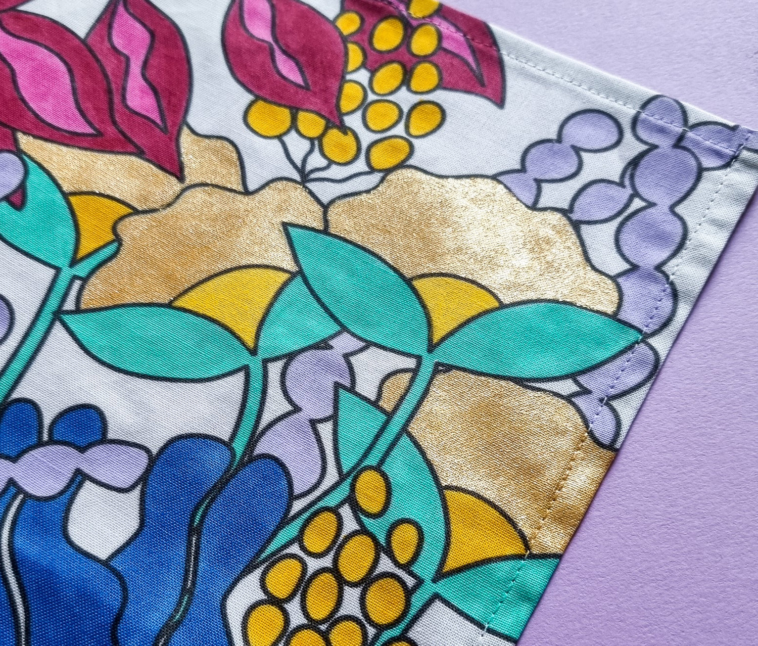
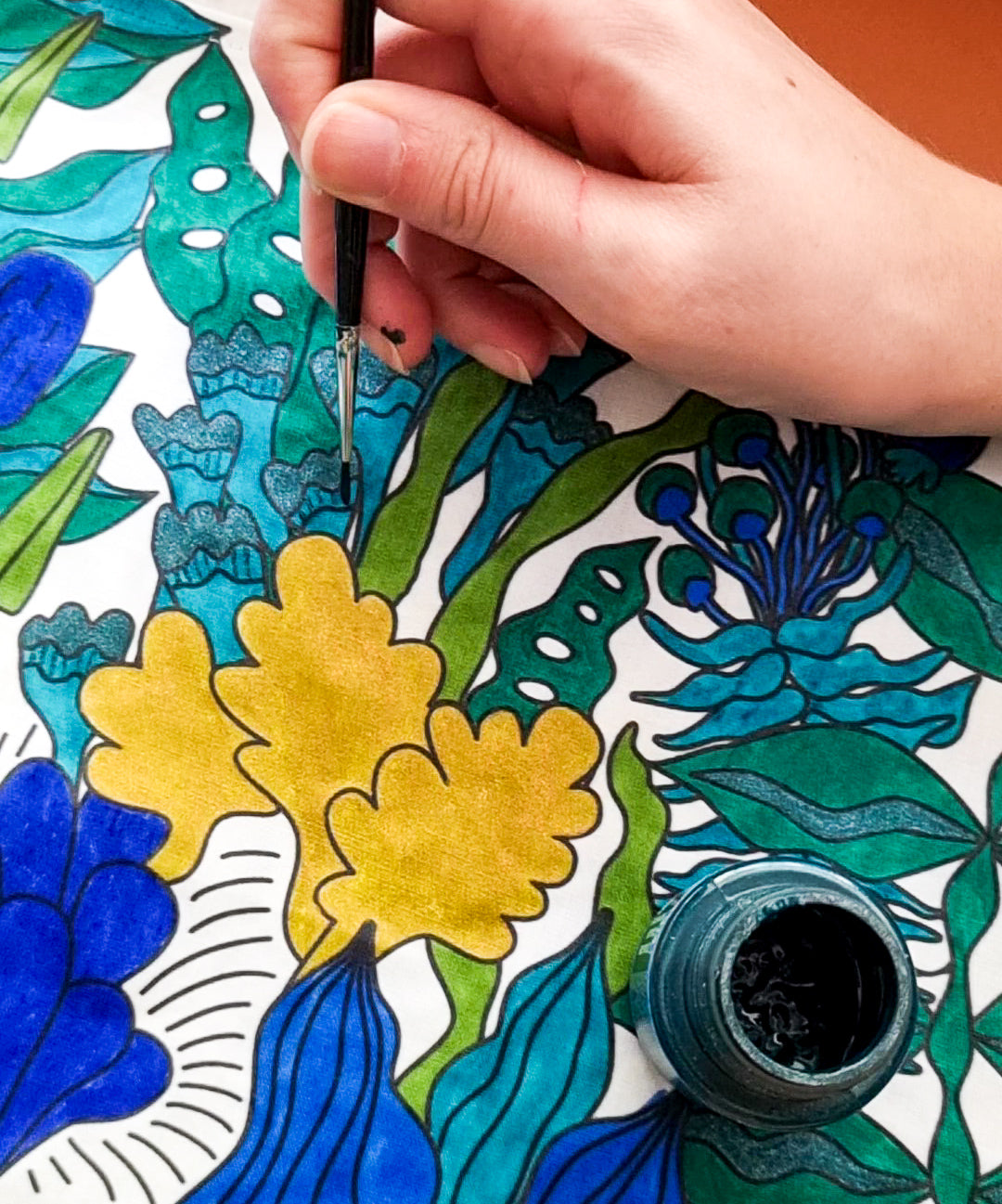
The Textil range also comes in some really great metallic colours. The yellow gold is just amazing - it's very densely packed with glitter, in a coloured base. Their rose gold shade is a sweet pink, but not quite as impactful as I would like to be honest. I recommend sticking to the yellow gold (I haven't tried the silver, it might be equally awesome!)
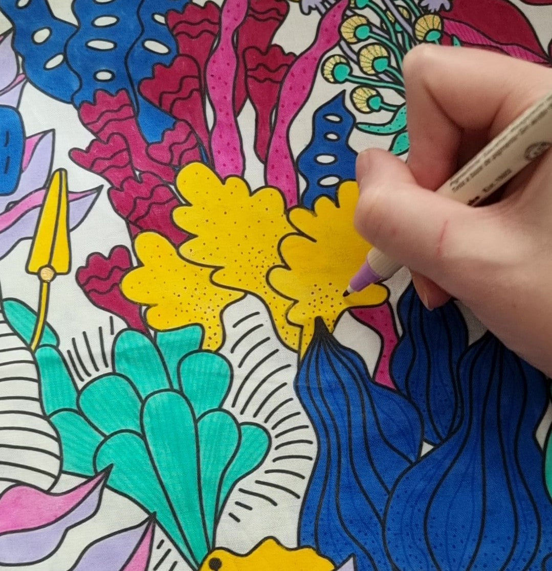
You can see the gold shine in the floral petals here...
Pebeo Setacolor may very well be my favourite brand to work with - they've got a great smooth texture, and the range is just unbeatable. And when I say range, I mean both in terms of number of colours and the loving the shades themselves, and also the range of types. Similar to Marabu they have light and dark fabric variants with differing opacity, but they also have a huge specialist finish range including glitters, shimmers, pearlescent / iridescent, fluorescent, even raised suede effects!
These paints stay impressively flexible after drying, even if you paint quite thickly.
If you're less excited by the idea of painting with a brush - there are also a lot of fabric marker options out there! Personally I don't love these as much because I feel like you don't get a huge amount of painting out of each marker, but their convenience and ease of use is undeniable.
This one is an Artline Shirt Marker. The ink flows nicely so the end result is quite even, but because it flows I also found it has a tendency to seep beyond the lines as it dries, so keep an eye on it!
I've also used the Dylon markers, but although I like their fabric paint, I found the markers to be too dry for my liking.
 }
}
Before you start painting, I recommend to plan out your colour scheme first. You don't need to necessarily decide precisely what each element will be coloured as, but it's ideal to pick which colours you'll use, and in roughly what proportion (e.g. evenly split, vs will some be primary vs secondary colours).
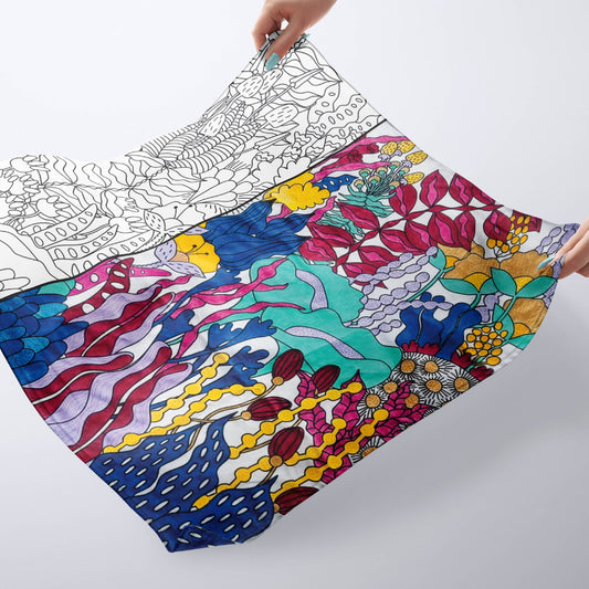
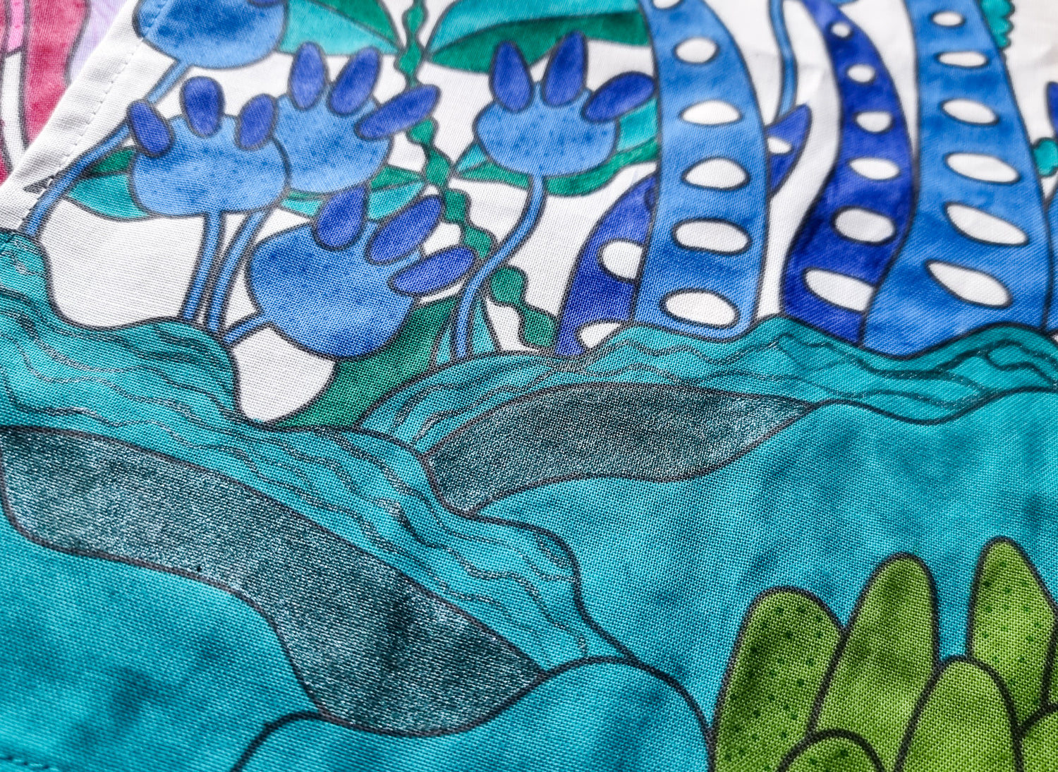
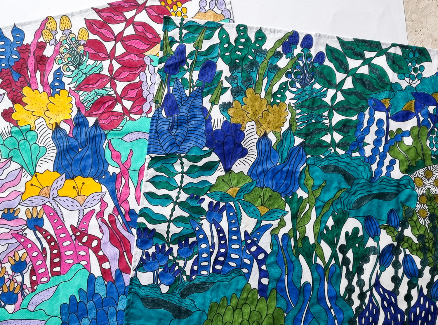
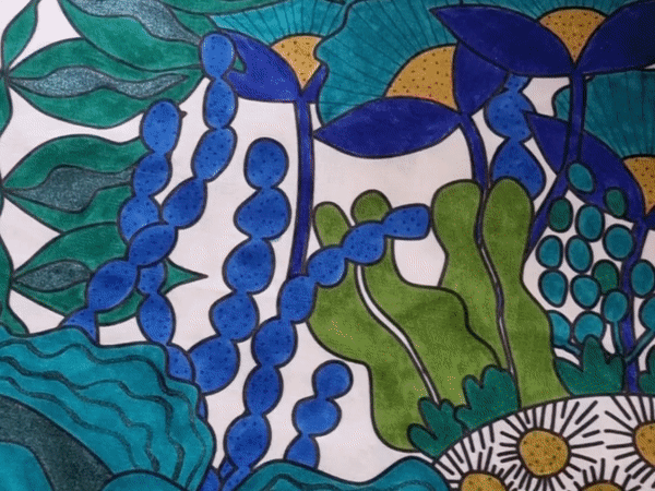
The colours you choose can hugely change the look of the end result. These two scarves are the same underlying illustration, but one uses bright, contrasting colours, while the other uses tones of ocean colours.
Choosing many shades and tones of the same colour can also be really impactful.
Plus - it pushes your creativity more, as it forces you to really think about how you are using each shade!
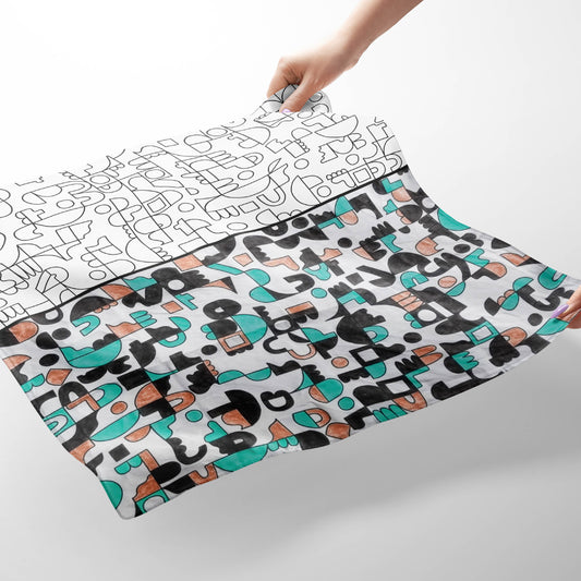
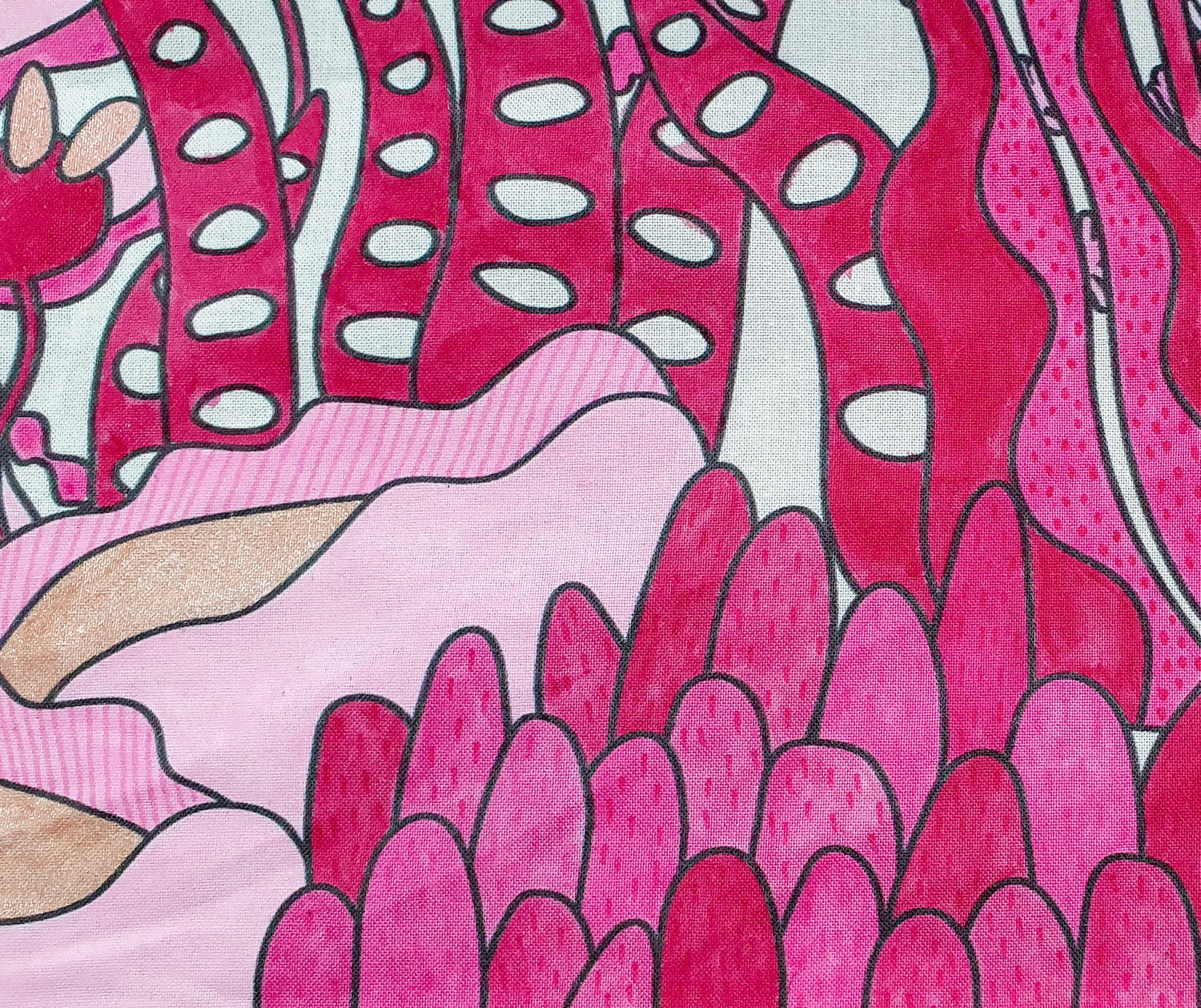
Choosing a restricted palette (such as a neutral, hero colour, and a metallic) can be a great way to highlight a colour you love. In this example, the first thing that really jumps out at you is the great shade of mint.
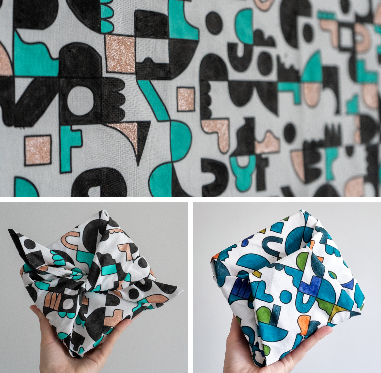
A similar idea to this is to restrict yourselves to many similar shades, with a pop (like these blues and greens, with a pop of orange).
 }
}
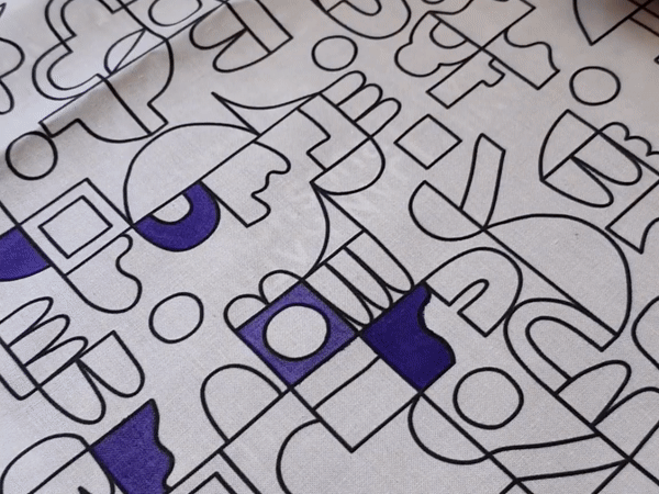
Where I do really love using markers is to add detailed designs - and for this my favs are Zig Fabricolor Textile Markers. They are double ended, with a flexible brush end and a pen style end. They come in lots of colours - but I do sometimes fing the result on fabric doesn't match the cap colour, so make sure you try them out on fabric before use!
There is no right or wrong here - just play around with different patterns, textures, and shapes!
You can use colours that are similar to the base painted colour to make it more subtle, or choose a contrasting colour to make your hand drawn pattern stand out.
If you're feeling confident about your steady hands (don't worry, it doesn't really matter - my hands wobble and the slight wiggles just add character!) you can also add patterns once your paint if fully dry by switching to a super fine paintbrush.
You can either try to keep the lines even, or purposefully move your paintbrush up and down slightly as you paint to create variable width to the lines.